We’re Catching Feelings: How Tile & Color Shape the Way a Home Feels
When buyers walk into a home, they don’t just see it—they feel it. And more often than not, that feeling is driven by something subtle but powerful: tile, color, and material choices. From a warm, earthy kitchen to a calming spa-like bathroom, the tones you choose in tile can completely shift the emotional experience of a space—and ultimately influence how quickly (and for how much) a home sells.
If you’re renovating, building, or preparing to list, here’s how to think about tile through the lens of emotion, design, and buyer psychology.
When buyers walk into a home, they don’t just see it—they feel it.
And more often than not, that feeling is driven by something subtle but powerful: tile, color, and material choices.
From a warm, earthy kitchen to a calming spa-like bathroom, the tones you choose in tile can completely shift the emotional experience of a space—and ultimately influence how quickly (and for how much) a home sells.
If you’re renovating, building, or preparing to list, here’s how to think about tile through the lens of emotion, design, and buyer psychology.
Cool Tones: Calm, Clean, and Restorative
Think: sage green, deep emerald, dusty blue, soft aqua
Cool-toned tile creates a sense of calm and clarity—perfect for spaces where buyers want to feel relaxed and reset.
Green tile, especially, is having a major moment. It pulls in a natural, grounding energy that works beautifully in Colorado homes where indoor-outdoor living is a lifestyle.
Blue tones, on the other hand, evoke cleanliness and tranquility—ideal for bathrooms and laundry spaces.
Why it works for resale:
These spaces photograph beautifully and feel universally appealing. They create a “this feels like a retreat” reaction.
Where to use it:
Primary bathrooms (showers or full feature walls)
Laundry rooms
Kitchen backsplashes paired with natural wood or brass
Secondary bathrooms for a fresh, polished look
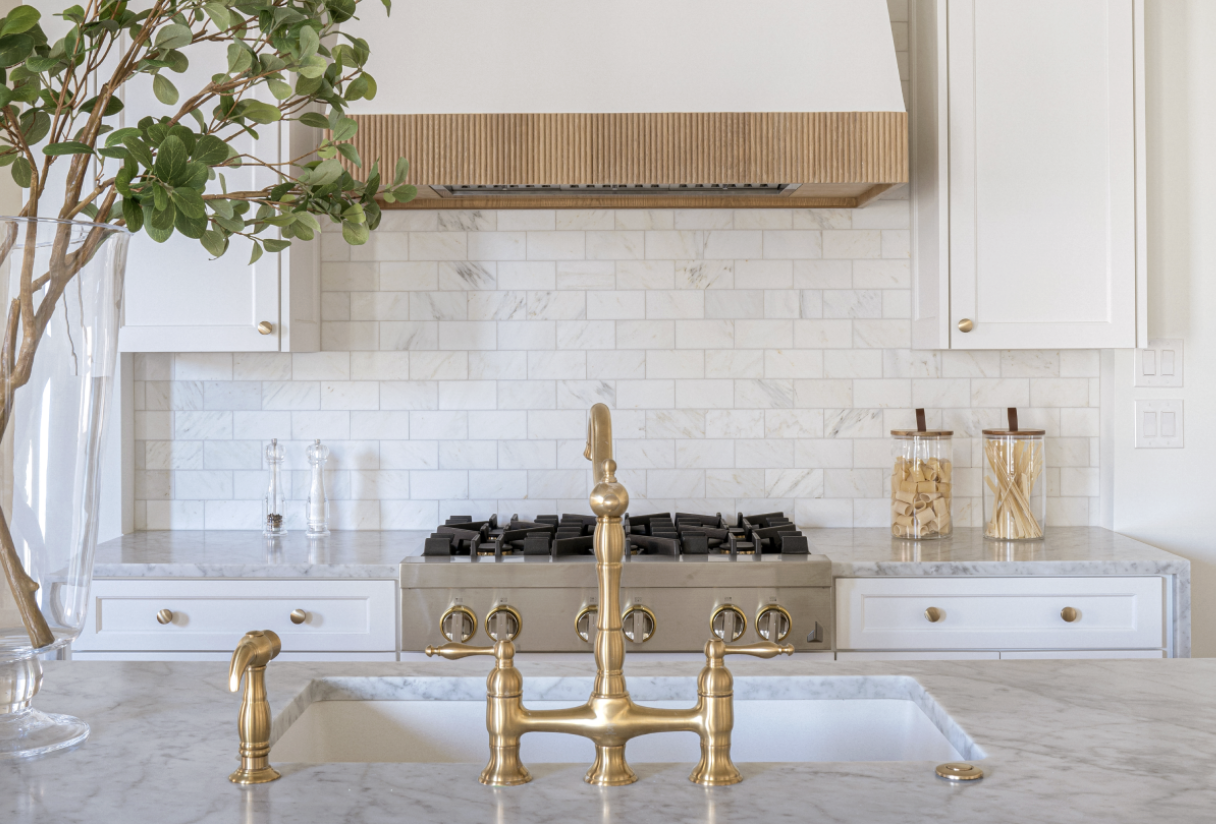
Neutral Tones: Timeless, Elevated, and Balanced
Think: creamy whites, soft grays, warm beiges, natural stone looks
Neutral tile is the foundation of great design—but that doesn’t mean it has to be boring.
The key is texture, variation, and materiality.
Handmade-look tiles, subtle tonal variation, or honed natural stone can take a neutral palette from basic to elevated. These tones create visual breathing room and allow other design elements (like lighting, cabinetry, or hardware) to shine.
Why it works for resale:
Neutrals are safe—but when done well, they feel expensive. They appeal to the widest range of buyers while still feeling intentional and high-end.
Where to use it:
Primary kitchens
Large-format flooring
Full bathrooms for a spa-like feel
Anywhere you want longevity and versatility
From a Real Estate Perspective… This Matters More Than You Think
I always tell my sellers: buyers decide how they feel about your home within seconds.
Tile and color choices quietly do the heavy lifting in that moment.
When we prep listings, we’re not just choosing finishes—we’re designing an experience that:
Photographs beautifully
Feels intentional in person
Creates emotional connection
And that’s what drives demand.
Thinking About Updating Your Home Before Selling?
Whether it’s a full renovation or a few strategic tile updates, the right design choices can completely change how your home is perceived—and what buyers are willing to pay.
If you’re curious where to invest (and where not to), I’m always happy to walk through it with you.